Cursor Sidekick cursor
A little sidekick that follows your cursor around. (´ ・ω・`)ノ╰(・ิω・ิ )
TIP
This component is designed for mouse input. It is recommended to use a computer or a device with a mouse.
Usage Examples
Basic Usage
Normally follows the cursor, with special interactions when touching specific elements.
View example source code
<template>
<div class="w-full flex flex-col gap-4 example-wrap">
<cursor-sidekick v-if="enable" />
<base-checkbox
v-model="enable"
:label="t('enableSidekick')"
class="example-ctrl"
/>
<div class="flex flex-col gap-2">
<div class="text-2xl font-bold">
{{ t('title') }}
</div>
<div>
{{ t('selectText') }}
</div>
<hr>
<base-input
v-model="text"
:label="t('textInput')"
/>
<div class="h-[20vh] w-1/2 border rounded">
<textarea
v-model="text"
:placeholder="t('multilineText')"
class="h-full w-full p-2"
/>
</div>
<div
contenteditable
class="w-2/3 border rounded p-2"
>
{{ t('editableDiv') }}
</div>
<hr>
<base-btn :label="t('button')" />
<base-btn
disabled
:label="t('naughtyBtn')"
/>
<hr>
<a
href="https://codlin.me/"
target="_blank"
>
{{ t('codlinBlog') }}
</a>
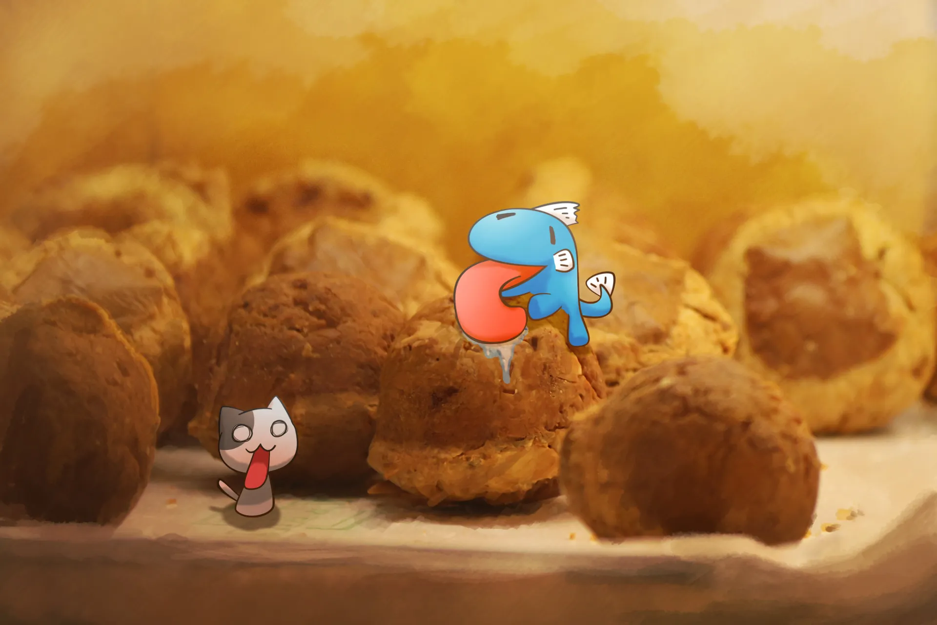
<img
src="/low/painting-codfish-bakery.webp"
:alt="t('greedyCodfish')"
>
</div>
</div>
</template>
<script setup lang="ts">
import { ref } from 'vue'
import { useI18n } from 'vue-i18n'
import BaseBtn from '../../base-btn.vue'
import BaseCheckbox from '../../base-checkbox.vue'
import BaseInput from '../../base-input.vue'
import CursorSidekick from '../cursor-sidekick.vue'
const enable = ref(false)
const text = ref('')
const { t } = useI18n()
</script>Custom Content
Design your own Provider to create all sorts of quirky interactions! ლ(´∀`ლ)
View example source code
<template>
<div class="w-full flex flex-col gap-4 example-wrap">
<cursor-sidekick
v-if="enable"
color="#35abf0"
:hover-providers="hoverProviderList"
:select-providers="selectProviderList"
/>
<base-checkbox
v-model="enable"
:label="t('enableSidekick')"
class="example-ctrl"
/>
<div class="flex flex-col gap-2">
<div>
{{ t('selectHint') }}
</div>
<hr>
<base-btn
disabled
:label="t('naughtyBtn')"
/>
<hr>
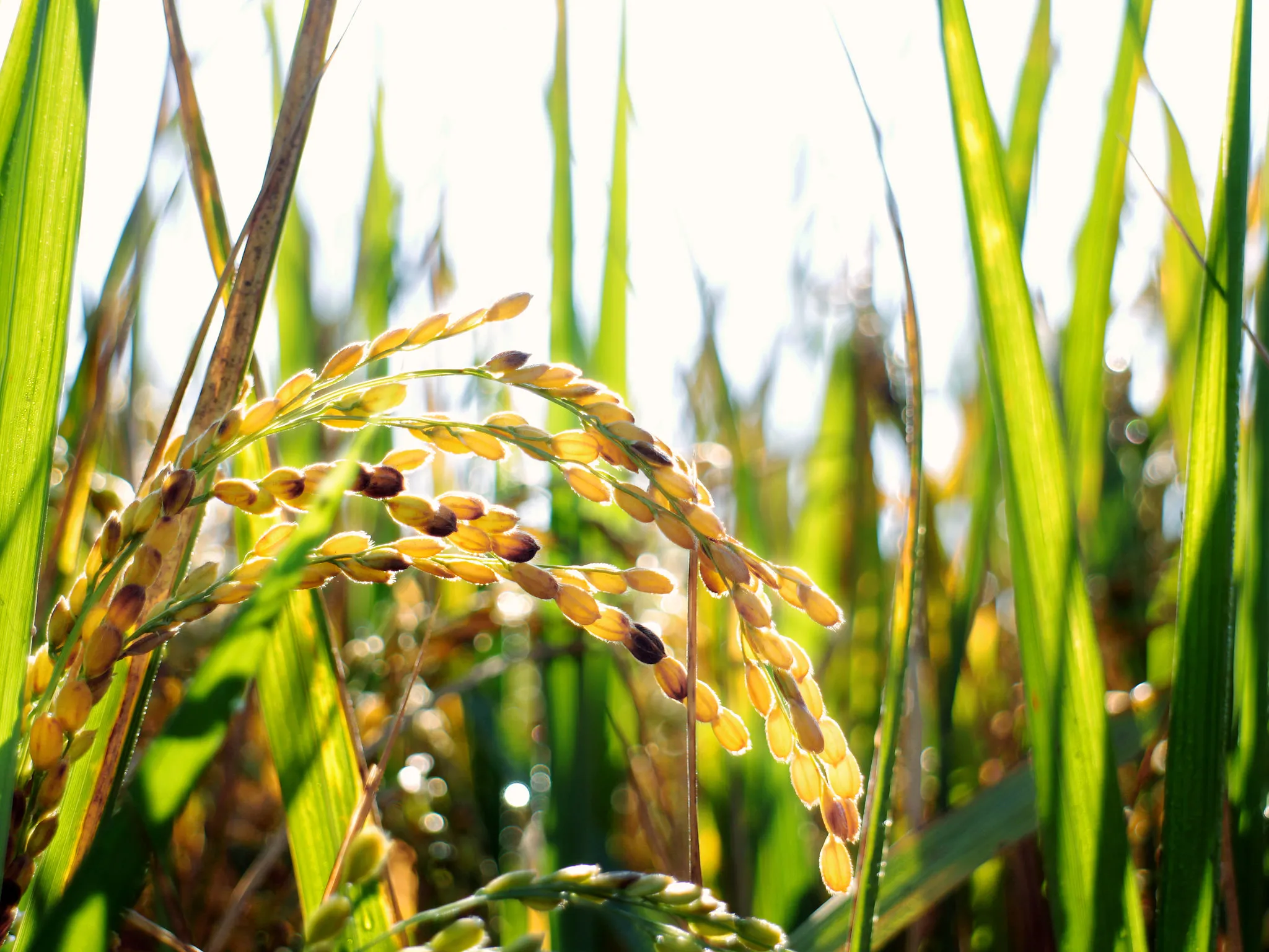
<img
src="/low/photography-ears-of-rice.webp"
url="https://www.flickr.com/photos/coodfish/albums/"
>
</div>
</div>
</template>
<script setup lang="ts">
import type { ContentProvider } from '../use-content-provider'
import { computed, ref } from 'vue'
import { useI18n } from 'vue-i18n'
import BaseBtn from '../../base-btn.vue'
import BaseCheckbox from '../../base-checkbox.vue'
import CursorSidekick from '../cursor-sidekick.vue'
const enable = ref(false)
const { t } = useI18n()
const hoverProviderList = computed<ContentProvider[]>(() => [
{
match(data) {
if ('rect' in data)
return false
if (
!(data instanceof HTMLButtonElement)
&& data?.getAttribute('role') !== 'button'
) {
return false
}
return data.innerHTML.includes('色色') || data.innerHTML.includes('naughty')
},
getContent: () => ({
btnList: [
{
label: t('naughtyPortal'),
onClick() {
window.open(
'https://raw.githubusercontent.com/tpai/dogedeck/main/cards/%E6%8A%97%E8%89%B2%E8%89%B2%E8%97%A5.png',
'_blank',
)
},
},
],
}),
},
{
match(data) {
if ('rect' in data)
return false
if (data instanceof HTMLImageElement) {
return true
}
return false
},
getContent(param) {
const { element } = param
const target = element?.value
if (!(target instanceof HTMLImageElement))
return
const url = target.getAttribute('url')
if (!url)
return
return {
btnList: [
{
label: t('viewMorePhotos'),
onClick() {
window.open(url ?? '', '_blank')
},
},
],
}
},
},
])
const selectProviderList = computed<ContentProvider[]>(() => [
{
match(data) {
if (!('rect' in data))
return false
return data.text.includes('鱈魚') || data.text.includes('Codfish')
},
getContent: () => ({
text: `${t('foundYouLine1')}<br>${t('foundYouLine2')}`,
class: ' text-nowrap ',
btnList: [
{
label: '🎬 Youtube',
onClick() {
window.open('https://www.youtube.com/@codfish2140', '_blank')
},
},
{
label: '💡 CodePen',
onClick() {
window.open('https://codepen.io/Codfish2140', '_blank')
},
},
{
label: t('codlinBlog'),
onClick() {
window.open('https://codlin.me/', '_blank')
},
},
],
}),
},
])
</script>How It Works
This little useless component probably uses the most browser APIs of any component. Here are the APIs and their applications:
Document: activeElement property : Gets the currently focused input element.
Document: elementFromPoint() method : Gets the currently hovered element.
Document: getSelection() method : Gets selected text and position.
Element: getBoundingClientRect() method : Gets the target element's dimensions and position.
The sidekick's morphing animation is powered by the trusty anime.js.
Tooltip positioning uses Floating UI, which is extremely powerful and highly recommended.
Source Code
API
Props
interface Props {
  /** 單位 px */
  size?: number;
  /** \# 前綴之 HEX 格式
   * @default '#515151'
   */
  color?: string;
  /** 最大速度。越慢小跟班越悠哉。單位 px/ms
   * @default 1
   */
  maxVelocity?: number;
  /**  @default 100 */
  zIndex?: number;

  /** 匹配 active element 的 provider。
   *
   * 通常用於可點擊或 focus 的元素。
   */
  activeProviders?: ContentProvider[];

  /** 匹配 hover element 的 provider
   *
   * 只要 hover 到符合條件的元素,即會觸發。
   */
  hoverProviders?: ContentProvider[];

  /** 匹配選取文字的 provider  */
  selectProviders?: ContentProvider[];
}ContentProvider definition:
interface BtnOption {
  label: string;
  onClick: (event?: Event) => void;
}

interface Content {
  /** 用於調整內容樣式 */
  class?: string;
  text?: string;
  /** 按鈕清單 */
  btnList?: BtnOption[];
  /** 預覽連結內容 */
  preview?: {
    src: string;
    class: string;
  };
}

export interface ContentProvider {
  /** 判斷目前元素或文字是否符合 */
  match: (
    data: HTMLElement | SelectionState
  ) => boolean;
  /** 取得小跟班顯示用內容 */
  getContent: (
    param: TargetParam
  ) => Content | undefined;
}